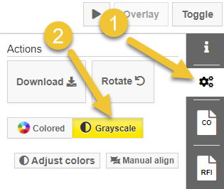
Using colours to highlight changes to drawings is overall intuitive and a pretty effective means of communicating differences. However, once in a while that can cause some issues: as it turns out, designers have also figured out that colour can be used to convey meaning! So what do you do when the drawing is full of colours drowning out the red-and-blue overlay?
Well, you shut out the noise! We’ve added a new colour filter that will enable you to shift your drawings (just temporarily, of course) from colourful to greyscale, so you can be sure that any colours you’re seeing are changes.